이 글은 이스라엘 개발자 탈리 가르시엘(Tali Garsiel)이 html5rocks.com에 게시한
"How Browsers Work: Behind the scenes of modern web browsers"를 인용하고 있습니다.
아무것도 모르는 초보자의 시선에서
하나하나 모르는 용어는 용어대로 찾아가면서
정리해보는 글입니다.
저와같이 아무것도 모르는 초보자를 기준으로 글을 작성했습니다.
부디 이 글에 마지막에는
글을 쓰고 있는 저도, 독자도 어렴풋이라도
브라우저가 어떻게 동작하는지 이해할 수 있었으면 좋겠습니다. 🙏
이 글은 브라우저 동작 원리 8편입니다.
다른 편은 아래 링크나 블로그에서 참조해주세요!

Firefox rule tree(파이어폭스 규칙 트리)
전문
Firefox has two extra trees for easier style computation: the rule tree and style context tree. WebKit also has style objects but they are not stored in a tree like the style context tree, only the DOM node points to its relevant style.
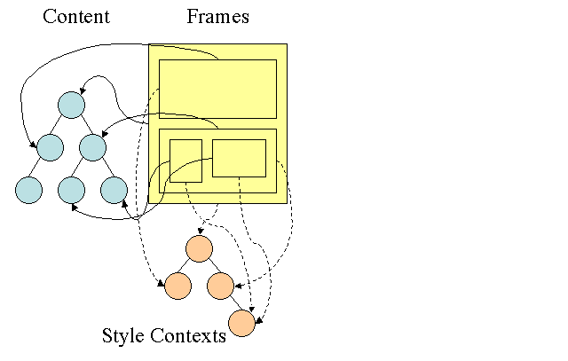
Figure : Firefox style context tree(2.2)
The style contexts contain end values. The values are computed by applying all the matching rules in the correct order and performing manipulations that transform them from logical to concrete values. For example, if the logical value is a percentage of the screen it will be calculated and transformed to absolute units. The rule tree idea is really clever. It enables sharing these values between nodes to avoid computing them again. This also saves space.
All the matched rules are stored in a tree. The bottom nodes in a path have higher priority. The tree contains all the paths for rule matches that were found. Storing the rules is done lazily. The tree isn't calculated at the beginning for every node, but whenever a node style needs to be computed the computed paths are added to the tree.
The idea is to see the tree paths as words in a lexicon. Lets say we already computed this rule tree:
Suppose we need to match rules for another element in the content tree, and find out the matched rules (in the correct order) are B-E-I. We already have this path in the tree because we already computed path A-B-E-I-L. We will now have less work to do.
Let's see how the tree saves us work.
파이어폭스는 스타일 계산을 쉽게 하기 위한 다음과 같은 두 개의 추가 트리가 존재합니다.
- Rule tree
- Style context tree
웹킷 역시 스타일 객체는 존재하지만 스타일 요소를 DOM으로만 처리합니다.
style context에는 최종 값이 저장되어 있습니다.
최종 값은 일치하는 모든 규칙을 올바른 순서로 적용하고
논리적인 값에서 구체적인 값으로 변환시키는 동작을 통해 계산됩니다.
예를 들어, 논리적인 값이 화면의 백분율 값이라면,
이 값은 계산되고 절대적인 단위로 변환됩니다.
rule tree는 이러한 최종 값을 노드 간에 공유하여
최종 값을 다시 계산하지 않도록 돕습니다.
또한 rule tree는 공간을 절약합니다.
매칭되는 모든 규칙은 트리에 저장됩니다.
최하단 노드가 가장 높은 우선순위를 갖습니다.
트리는 규칙이 일치하는 것으로 발견된 모든 경로를 포함하고 있습니다.
규칙을 저장하는 것은 느리게 수행됩니다.
트리는 모든 노드에 대해 시작부터 계산되지 않고,
노드 스타일을 계산해야 할 때마다 계산된 경로가 트리에 추가됩니다.
Division into structs(구조체로 분리)
전문
The style contexts are divided into structs. Those structs contain style information for a certain category like border or color. All the properties in a struct are either inherited or non inherited. Inherited properties are properties that unless defined by the element, are inherited from its parent. Non inherited properties (called "reset" properties) use default values if not defined.
The tree helps us by caching entire structs (containing the computed end values) in the tree. The idea is that if the bottom node didn't supply a definition for a struct, a cached struct in an upper node can be used.
Style context는 구조체(structs)로 나뉩니다.
이러한 구조체는 border의 색과 같은 특정 카테고리에 속한 스타일 정보를 포함합니다.
구조체에 존재하는 모든 속성은 상속되거나 상속되지 않습니다.
상속된 속성은 요소에서 정의하지 않는 한 부모로부터 상속되는 속성입니다.
상속되지 않는 속성은 'reset' 속성이라고 불리며,
정의되지 않는 경우 기본 값을 사용합니다.
트리는 계산된 최종 값을 포함한 전체 구조체를 캐싱합니다.
만약 하위 노드에서 구조체를 위한 속성을 선언하지 않는다면,
캐시된 상위 노드의 구조체 속성을 그대로 사용하게 됩니다.
Computing the style contexts using the rule tree
(rule tree를 이용해 style contexts 계산하기)
전문
When computing the style context for a certain element, we first compute a path in the rule tree or use an existing one. We then begin to apply the rules in the path to fill the structs in our new style context. We start at the bottom node of the path–the one with the highest precedence (usually the most specific selector) and traverse the tree up until our struct is full. If there is no specification for the struct in that rule node, then we can greatly optimize–we go up the tree until we find a node that specifies it fully and simply point to it–that's the best optimization–the entire struct is shared. This saves computation of end values and memory.
If we find partial definitions we go up the tree until the struct is filled.
If we didn't find any definitions for our struct then, in case the struct is an "inherited" type, we point to the struct of our parent in the context tree. In this case we also succeeded in sharing structs. If it's a reset struct then default values will be used.
If the most specific node does add values then we need to do some extra calculations for transforming it to actual values. We then cache the result in the tree node so it can be used by children.
In case an element has a sibling or a brother that points to the same tree node then the entire style context can be shared between them.
Lets see an example: Suppose we have this HTML
<html>
  <body>
    <div class="err" id="div1">
      <p>
        this is a <span class="big"> big error </span>
        this is also a
        <span class="big"> very  big  error</span> error
      </p>
    </div>
    <div class="err" id="div2">another error</div>
  </body>
</html>
And the following rules:
- div {margin:5px;color:black}
- .err {color:red}
- .big {margin-top:3px}
- div span {margin-bottom:4px}
- #div1 {color:blue}
- #div2 {color:green}
To simplify things let's say we need to fill out only two structs: the color struct and the margin struct. The color struct contains only one member: the color The margin struct contains the four sides.
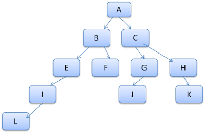
The resulting rule tree will look like this (the nodes are marked with the node name: the number of the rule they point at):
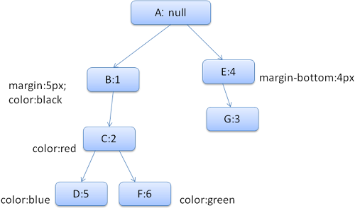
Figure : The rule tree
The context tree will look like this (node name: rule node they point to):
Figure : The context tree
Suppose we parse the HTML and get to the second <div> tag. We need to create a style context for this node and fill its style structs.
We will match the rules and discover that the matching rules for the <div> are 1, 2 and 6. This means there is already an existing path in the tree that our element can use and we just need to add another node to it for rule 6 (node F in the rule tree).
We will create a style context and put it in the context tree. The new style context will point to node F in the rule tree.
We now need to fill the style structs. We will begin by filling out the margin struct. Since the last rule node (F) doesn't add to the margin struct, we can go up the tree until we find a cached struct computed in a previous node insertion and use it. We will find it on node B, which is the uppermost node that specified margin rules.
We do have a definition for the color struct, so we can't use a cached struct. Since color has one attribute we don't need to go up the tree to fill other attributes. We will compute the end value (convert string to RGB etc) and cache the computed struct on this node.
The work on the second <span> element is even easier. We will match the rules and come to the conclusion that it points to rule G, like the previous span. Since we have siblings that point to the same node, we can share the entire style context and just point to the context of the previous span.
For structs that contain rules that are inherited from the parent, caching is done on the context tree (the color property is actually inherited, but Firefox treats it as reset and caches it on the rule tree).
For instance if we added rules for fonts in a paragraph:
p {font-family: Verdana; font size: 10px; font-weight: bold}Then the paragraph element, which is a child of the div in the context tree, could have shared the same font struct as his parent. This is if no font rules were specified for the paragraph.
In WebKit, who does not have a rule tree, the matched declarations are traversed four times. First non-important high priority properties are applied (properties that should be applied first because others depend on them, such as display), then high priority important, then normal priority non-important, then normal priority important rules. This means that properties that appear multiple times will be resolved according to the correct cascade order. The last wins.
So to summarize: sharing the style objects (entirely or some of the structs inside them) solves issues 1 and 3. The Firefox rule tree also helps in applying the properties in the correct order.
특정 요소에 대한 style context를 계산할 때,
먼저 rule tree의 경로를 계산하거나 기존 경로를 사용합니다.
그다음 새로운 style context을 채우기 위해 경로에 규칙을 적용합니다.
경로의 최하단 노드에서 시작해 구조체가 가득 채워질 때까지 트리를 탐색합니다.
해당 규칙에 대한 선언이 완전하지 않으면 구조체를 다 채울 때까지 트리의 상단을 탐색합니다.
이러한 방식은 최적화에 상당히 기인하게 됩니다.
이는 앞서 말했듯이 구조체의 모든 요소가 '상속되거나' '상속되지 않기' 때문입니다.
쉽게 예시를 보면서 설명해보겠습니다.

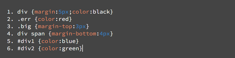
위의 html 문서가 그 아래의 스타일 규칙을 따른다고 가정해보겠습니다.
우리는 앞서 style context는 구조체로 나뉘고,
구조체의 모든 요소는 상속되거나 상속되지 않는다는 것을 알았습니다.
이 내용을 이해하면서 생성되는 rule 트리와 context 트리를 보겠습니다.

규칙 트리의 각 노드는 노드 이름과 노드가 가리키는 규칙의 번호로 표시되어 있습니다.

문맥 트리의 각 노드는 노드 이름과 노드가 가리키는 규칙 노드로 표시되어 있습니다.
생성된 두 트리를 보면서 예시를 들어보겠습니다.
HTML 문서를 파싱하여 두 번째 <div> 태그인 <div class="err" id="div2">를 파싱 한다고 가정해보겠습니다.
두 번째 div 태그에 맞는 스타일 규칙은 1번과 2번 그리고 6번입니다.
이때, 첫 번째 div 태그는 <div class="err" id="div1">으로
스타일 규칙을 적용해본다면, 1번 2번 그리고 5번입니다.
따라서 두 번재 div 태그를 파싱 하기 전에
첫 번째 div 태그를 통해 1번과 2번까지의 트리 경로가 이미 생성되어 있기 때문에
두 번째 div 태그를 파싱할 때는 6번 규칙에 대한 노드를 트리에 추가하면 됩니다.
style context를 생성하고 context 트리에 이를 추가하면,
새로운 style 문맥이 규칙 트리의 F:6 노드를 가리키게 됩니다.
style context가 생성되었으니 이제 스타일 구조체를 채워야 합니다.
1번 2번 6번에 이르는 경로에서 6번(F:6)은 여백에 관한 구조체를 포함하고 있지 않기 때문에
상위 노드를 탐색하면서 여백에 관한 구조체를 찾습니다.
이 경우 1번(B:1)에서 'margin : 5px'이 정의되어 있습니다.
그렇다면 여백에 관한 어떠한 구조체도 포함되어 있지 않다면 어떻게 될까요?
그렇다면 기본값을 사용하게 됩니다.
색상에 관한 구조체는 여백과 조금 다릅니다.
색상 구조체는 여백과 달리 저장된 구조체를 사용하지 않습니다.
색상은 이미 하나의 속성을 갖고 있기 때문입니다.
이 경우 F:6이 가리키는 'color:green'이 속성 값이 됩니다.
이번에는 다른 태그를 확인해볼까요?
두 번째 있는 <span> 태그는 훨씬 쉽게 파싱됩니다.
두 번째 span태그는 첫 번째 span태그와 동일한 class를 갖고 있습니다.
이는 둘이 동일한 노드를 가리키고 있는 형제 노드라는 것이고,
형제 노드끼리는 전체 style context를 공유할 수 있기 때문에
두 번째 span태그는 이전 span 태그의 context를 공유합니다.
Manipulating the rules for an easy match
(쉬운 매치를 위한 규칙 조작)
전문
There are several sources for style rules:
- CSS rules, either in external style sheets or in style elements.
p {color: blue} - Inline style attributes like
<p style="color: blue" /> - HTML visual attributes (which are mapped to relevant style rules)
<p bgcolor="blue" />
The last two are easily matched to the element since he owns the style attributes and HTML attributes can be mapped using the element as the key.
As noted previously in issue #2, the CSS rule matching can be trickier. To solve the difficulty, the rules are manipulated for easier access.
After parsing the style sheet, the rules are added to one of several hash maps, according to the selector. There are maps by id, by class name, by tag name and a general map for anything that doesn't fit into those categories. If the selector is an id, the rule will be added to the id map, if it's a class it will be added to the class map etc.
This manipulation makes it much easier to match rules. There is no need to look in every declaration: we can extract the relevant rules for an element from the maps. This optimization eliminates 95+% of the rules, so that they need not even be considered during the matching process(4.1).
Let's see for example the following style rules:
p.error {color: red}
#messageDiv {height: 50px}
div {margin: 5px}
The first rule will be inserted into the class map. The second into the id map and the third into the tag map.
For the following HTML fragment;
<p class="error">an error occurred </p>
<div id=" messageDiv">this is a message</div>
We will first try to find rules for the p element. The class map will contain an "error" key under which the rule for "p.error" is found. The div element will have relevant rules in the id map (the key is the id) and the tag map. So the only work left is finding out which of the rules that were extracted by the keys really match.
For example if the rule for the div was
table div {margin: 5px}it will still be extracted from the tag map, because the key is the rightmost selector, but it would not match our div element, who does not have a table ancestor.
Both WebKit and Firefox do this manipulation.
앞서 말했듯이
CSS나 스크립트를 처리하는데 3가지 방식이 존재합니다.
- external 방식 : 외부에 CSS 파일을 만들어 삽입
- internal 방식 : HTML 문서에서 태그 밖에 CSS 스타일을 지정
- inline 방식 : 태그 안에 직접 스타일을 지정
하나씩 예제를 통해 확인해보겠습니다.
1. external 방식/internal 방식

2. inline 방식
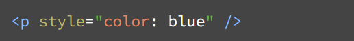
이러한 스타일을 적용할 때
inline 방식이 아닌 external이나 internal 방식의 경우
보통 선택자를 사용하는 경우가 많습니다.
선택자의 경우 아이디나 클래스, 이름, 태그 이름 등이 될 수 있습니다.
스타일 시트를 파싱 하게 되면 규칙은 선택자에 따라 여러 해시맵 중 하나에 추가됩니다.
예를 들어, 선택자가 아이디인 경우 규칙은 아이디 맵에 추가되고,
선택자가 클래스인 경우 규칙은 클래스 맵에 추가됩니다.
이러한 과정은 규칙을 훨씬 빠르게 매칭 시킬 수 있습니다.
선언된 모든 스타일 규칙을 찾을 필요가 없기 때문입니다.
예를 들어보겠습니다.

위의 예시 사진에서 첫 번째 규칙은 클래스 맵에 추가됩니다.(.error)
두 번째 규칙은 아이디 맵에 추가되고(#messageDiv), 세 번째는 태그 맵에 추가됩니다.
위 스타일과 관련된 HTML 코드는 다음과 같습니다.
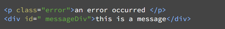
위의 코드에서 규칙을 순차적으로 찾는다면
p태그를 찾게 되고 p 태그 하위에 error 클래스를 통해 규칙을 찾을 수 있습니다.
또한 div 태그는 div 태그와 일치하는 규칙과 messageDiv ID를 통해 일치하는 규칙을 찾을 수 있습니다.

그렇다면 위의 스타일은 어떨까요?
이 예시에서도 여전히 태그 맵에서 규칙을 찾게 됩니다.
가장 우측에 있는 선택자가 키가 되기 때문입니다.
하지만 앞서 작성한 div 요소와 일치하지는 않습니다.
table 태그가 정의되어 있지 않기 때문입니다.
Applying the rules in the correct cascade order
(계단식 순서에 따라 규칙 적용)
전문
The style object has properties corresponding to every visual attribute (all CSS attributes but more generic). If the property is not defined by any of the matched rules, then some properties can be inherited by the parent element style object. Other properties have default values.
The problem begins when there is more than one definition–here comes the cascade order to solve the issue.
스타일 객체는 모든 시각적 속성에 해당하는 속성이 있습니다.
만약에 이러한 속성이 어떠한 규칙과도 일치하지 않는다면,
일부 속성은 상위 스타일 요소 스타일 객체에 의해 상속될 수 있습니다.
그 외 다른 속성들은 기본 값으로 설정됩니다.
문제는 둘 이상의 속성에 대한 정의가 있을 때입니다.
이때 계단식 순서가 문제 해결에 도움을 줍니다.
Style sheet cascade order(스타일 시트의 계단식 순서)
전문
A declaration for a style property can appear in several style sheets, and several times inside a style sheet. This means the order of applying the rules is very important. This is called the "cascade" order. According to CSS2 spec, the cascade order is (from low to high):
- Browser declarations
- User normal declarations
- Author normal declarations
- Author important declarations
- User important declarations
The browser declarations are least important and the user overrides the author only if the declaration was marked as important. Declarations with the same order will be sorted by specificity and then the order they are specified. The HTML visual attributes are translated to matching CSS declarations. They are treated as author rules with low priority.
하나의 요소에 대한 스타일 속성 선언은 여러 스타일 시트에서 나타날 수 있고,
하나의 스타일 시트 안에서도 여러 번 나타날 수 있습니다.
때문에 이렇게 여러 번 나타나는 스타일 속성에 대한 적용은 그 순서가 상당히 중요합니다.
이렇게 여러 번 나타나는 스타일 속성에 대한 순서를 계단식 순서(Cascade order)라고 합니다.
CSS2 명세에 따르면 다단계 순서는 다음과 같습니다.(우선순위가 낮은 순위부터)
- 브라우저 선언(Browser declarations)
- 사용자 일반 선언(User normal declarations)
- 작성자 일반 선언(Author normal declarations)
- 작성자 중요 선언(Author important declarations)
- 사용자 중요 선언(User important declarations)
HTML의 시각 속성들은 CSS 속성 선언으로 변환됩니다.
이렇게 변환된 시각 속성들은 작성자 일반 선언 규칙으로 선언됩니다.
Specificity(특정성)
전문
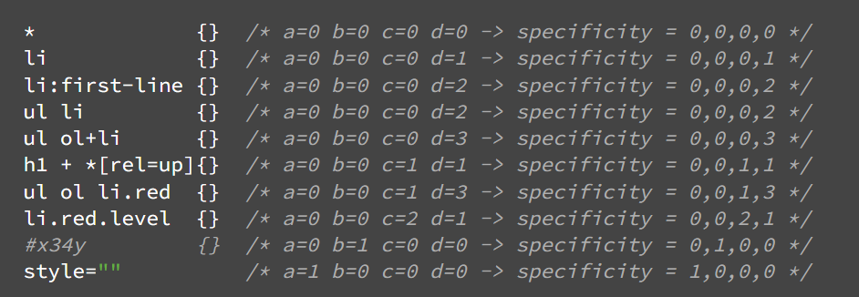
The selector specificity is defined by the CSS2 specification as follows:
- count 1 if the declaration it is from is a 'style' attribute rather than a rule with a selector, 0 otherwise (= a)
- count the number of ID attributes in the selector (= b)
- count the number of other attributes and pseudo-classes in the selector (= c)
- count the number of element names and pseudo-elements in the selector (= d)
Concatenating the four numbers a-b-c-d (in a number system with a large base) gives the specificity.
The number base you need to use is defined by the highest count you have in one of the categories.
For example, if a=14 you can use hexadecimal base. In the unlikely case where a=17 you will need a 17 digits number base. The later situation can happen with a selector like this: html body div div p... (17 tags in your selector.. not very likely).
Some examples:
 *             {}  /* a=0 b=0 c=0 d=0 -> specificity = 0,0,0,0 */
 li            {}  /* a=0 b=0 c=0 d=1 -> specificity = 0,0,0,1 */
 li:first-line {}  /* a=0 b=0 c=0 d=2 -> specificity = 0,0,0,2 */
 ul li         {}  /* a=0 b=0 c=0 d=2 -> specificity = 0,0,0,2 */
 ul ol+li      {}  /* a=0 b=0 c=0 d=3 -> specificity = 0,0,0,3 */
 h1 + *[rel=up]{}  /* a=0 b=0 c=1 d=1 -> specificity = 0,0,1,1 */
 ul ol li.red  {}  /* a=0 b=0 c=1 d=3 -> specificity = 0,0,1,3 */
 li.red.level  {}  /* a=0 b=0 c=2 d=1 -> specificity = 0,0,2,1 */
 #x34y         {}  /* a=0 b=1 c=0 d=0 -> specificity = 0,1,0,0 */
 style=""          /* a=1 b=0 c=0 d=0 -> specificity = 1,0,0,0 */
Sorting the rules
After the rules are matched, they are sorted according to the cascade rules. WebKit uses bubble sort for small lists and merge sort for big ones. WebKit implements sorting by overriding the ">" operator for the rules:
static bool operator >(CSSRuleData& r1, CSSRuleData& r2)
{
    int spec1 = r1.selector()->specificity();
    int spec2 = r2.selector()->specificity();
    return (spec1 == spec2) : r1.position() > r2.position() : spec1 > spec2;
}
선택자에 대한 특정성은 CSS2에 다음과 같이 정의되어 있습니다.
- 선택자 없이 스타일 속성이 선언되면 1을 센다. 그렇지 않으면 0을 센다.(=a)
- 선택자에 포함된 아이디 선택자 개수를 센다. (=b)
- 선택자의 다른 속성(ex 클래스 선택자)과 가상 클래스를 센다.(=c)
- 선택자의 요소 이름의 수와 가상 요소의 수를 센다.(=d)
여기서 가상 클래스와 가상 요소는 선택자에 추가하는 키워드를 말합니다.
가상 클래스의 대표적인 키워드로는 ':hover', ':active' 등이 있고,
가상 요소의 대표적인 키워드로는 '::after', '::before' 등이 있습니다.
가상 클래스는 요소의 특정 상태에 스타일을 적용할 때 사용하고,
가상 요소는 요소의 특정 부분에 스타일을 적용할 때 사용합니다.
다시 선택자의 특정성으로 돌아와서 설명을 이어가겠습니다.
위에서 언급한 a, b, c, d를 연결하면 특정성이 생깁니다.
사용할 진법은 a, b, c, d 카테고리에 속한 숫자 중 가장 큰 수로 정의됩니다.
예를 들어, a=14이면 16진수를 사용할 수 있습니다.
흔치는 않지만 a=17과 같은 경우라면 17진법이 필요합니다.
다음 예시를 통해 특정성이 어떻게 계산되는지 이해할 수 있습니다.
Sorting the rules(규칙 정렬)
전문
After the rules are matched, they are sorted according to the cascade rules. WebKit uses bubble sort for small lists and merge sort for big ones. WebKit implements sorting by overriding the ">" operator for the rules:
static bool operator >(CSSRuleData& r1, CSSRuleData& r2)
{
    int spec1 = r1.selector()->specificity();
    int spec2 = r2.selector()->specificity();
    return (spec1 == spec2) : r1.position() > r2.position() : spec1 > spec2;
}
매칭 되는 규칙을 찾으면 계단식 규칙에 따라 정렬됩니다.
Webkit은 리스트가 적으면 버블 정렬을 사용하고,
리스트가 많으면 병합 정렬을 사용합니다.
Webkit은 ">" 연산자를 규칙에 덮어쓰는 방식으로 정렬을 실행합니다.
Gradual process(점진적 처리)
전문
WebKit uses a flag that marks if all top level style sheets (including @imports) have been loaded. If the style is not fully loaded when attaching, place holders are used and it is marked in the document, and they will be recalculated once the style sheets were loaded.
Webkit은 최상위 수준의 스타일 시트(@import를 포함)가 로드되었는지 표시하기 위해 플래그를 사용합니다.
만약 attaching과정에서 스타일 시트가 완전히 로드되지 않았다면 문서에 place holder를 사용하고
스타일 시트가 로드됐을 때 다시 계산하게 됩니다.
이따 Webkit에서 attaching은 DOM 노드와 스타일 요소를 연결하는 과정을 말합니다.
Layout(레이아웃)
전문
When the renderer is created and added to the tree, it does not have a position and size. Calculating these values is called layout or reflow.
HTML uses a flow based layout model, meaning that most of the time it is possible to compute the geometry in a single pass. Elements later ``in the flow'' typically do not affect the geometry of elements that are earlier ``in the flow'', so layout can proceed left-to-right, top-to-bottom through the document. There are exceptions: for example, HTML tables may require more than one pass (3.5).
The coordinate system is relative to the root frame. Top and left coordinates are used.
Layout is a recursive process. It begins at the root renderer, which corresponds to the <html> element of the HTML document. Layout continues recursively through some or all of the frame hierarchy, computing geometric information for each renderer that requires it.
The position of the root renderer is 0,0 and its dimensions are the viewport–the visible part of the browser window.
All renderers have a "layout" or "reflow" method, each renderer invokes the layout method of its children that need layout.
렌더 트리의 요소인 렌더러가 생성되고 트리에 추가되면
렌더러는 위치와 사이즈 정보를 가지고 있지 않습니다.
이러한 값을 계산하는 것을 '레이아웃' 혹은 'reflow'라고 부릅니다.
HTML은 흐름 기반의 레이아웃 모델을 사용합니다.
이는 보통 단일 경로를 통해 기하학적 정보를 계산할 수 있다는 것을 의미합니다.
일반적으로 "흐름 속에서" 나중에 있는 요소는
"흐름 속에서" 이미 존재하고 있는 요소의 기하학적인 부분에 영향을 주지 않습니다.
때문에 레이아웃은 왼쪽에서 오른쪽으로, 위에서 아래로 진행될 수 있습니다.
하지만 예외가 존재합니다.
예를 들어, HTML 테이블(표)의 경우 크기와 위치를 계산하기 위해
하나 이상의 경로를 필요로 합니다.
좌표계는 루트 프레임을 기준으로 합니다.
Top과 Left 좌표가 사용됩니다.
레이아웃은 재귀적 프로세스입니다.
레이아웃은 HTML 문서의 HTML 요소에 해당하는
루트 렌더러에서 시작합니다.
레이아웃은 프레임 계층의 일부 혹은 전부를 통해
재귀적으로 반복되고, 각 렌더러에 필요한 기하학적 정보를 계산합니다.
루트 렌더러의 좌표는 (0,0)입니다.
또한 루트 렌더러의 치수는 viewport입니다.
viewport는 브라우저 창의 보이는 부분을 의미합니다.
모든 렌더러는 layout이나 reflow라는 메서드가 있으며,
각 렌더러는 배치해야 할 자식의 레이아웃 메서드를 불러옵니다.
Dirty bit system(더티 비트 시스템)
전문
In order not to do a full layout for every small change, browsers use a "dirty bit" system. A renderer that is changed or added marks itself and its children as "dirty": needing layout.
There are two flags: "dirty", and "children are dirty" which means that although the renderer itself may be OK, it has at least one child that needs a layout.
모든 작은 변경에 전체 배치를 바꾸지 않기 위해서
브라우저는 "dirty bit" 시스템을 사용합니다.
렌더러는 다시 배치해야 하는 변경 요소 또는 추가된 요소와
그 자식 요소를 "dirty"라고 표시합니다.
"더티"와 "자식 더티" 두 가지 플래그가 존재하는데
자식이 더티하다는 것은 렌더러 자체는 괜찮지만
자식 요소 중 적어도 하나는 다시 배치할 필요가 있다는 것을 의미합니다.
Global and incremental layout(전역, 점증 배치)
전문
Layout can be triggered on the entire render tree–this is "global" layout. This can happen as a result of:
- A global style change that affects all renderers, like a font size change.
- As a result of a screen being resized
Layout can be incremental, only the dirty renderers will be laid out (this can cause some damage which will require extra layouts).
Incremental layout is triggered (asynchronously) when renderers are dirty. For example when new renderers are appended to the render tree after extra content came from the network and was added to the DOM tree.
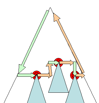
Figure : Incremental layout–only dirty renderers and their children are laid out (3.6)
배치는 렌더러 트리 전체에서 발생할 수 있고,
이를 전역 배치라고 합니다.
전역 배치는 다음의 경우 일어날 수 있습니다.
- 글꼴 크기 변경과 같은 전체 렌더러에 영향을 끼치는 스타일 변경
- 화면의 사이즈가 변경되는 경우
점증적 배치는 더티 렌더러가 배치되는 경우에만 발생합니다.
점증적 배치의 경우 추가 레이아웃이 필요하기 때문에 약간의 손상이 발생할 수 있습니다.
점증 배치는 렌더러가 더티 렌더러일 때 비동기적으로 일어납니다.
예를 들어, 네트워크로부터 온 추가 내용을 DOM 트리에 추가한 후
새로운 렌더러가 렌더 트리에 추가되는 경우를 말합니다.
Asynchronous and Synchronous layout(비동기/동기 배치)
전문
Incremental layout is done asynchronously. Firefox queues "reflow commands" for incremental layouts and a scheduler triggers batch execution of these commands. WebKit also has a timer that executes an incremental layout–the tree is traversed and "dirty" renderers are layout out.
Scripts asking for style information, like "offsetHeight" can trigger incremental layout synchronously.
Global layout will usually be triggered synchronously.
Sometimes layout is triggered as a callback after an initial layout because some attributes, like the scrolling position changed.
점증적 배치는 비동기적으로 동작합니다.
파이어폭스는 점증적 배치를 위해 "reflow commands"를 대기열에 쌓아 두고,
스케줄러는 이를 한 번에 실행합니다.
Webkit은 점증 배치를 실행하는 타이머가 있습니다.
트리가 탐색되고 더티 렌더러가 배치됩니다.
스타일 정보를 요청하는 스크립트는(ex offsetHeight) 동기적으로 점증 배치를 실행합니다.
전역 배치는 보통 동기적으로 동작합니다.
가끔 배치는 스크롤 위치 변화와 같은 일부 속성들 때문에 초기 배치 이후에 콜백으로 실행됩니다.
Optimizations(최적화)
전문
When a layout is triggered by a "resize" or a change in the renderer position(and not size), the renders sizes are taken from a cache and not recalculated..
In some cases only a sub tree is modified and layout does not start from the root. This can happen in cases where the change is local and does not affect its surroundings–like text inserted into text fields (otherwise every keystroke would trigger a layout starting from the root).
배치가 리사이즈(resize)나 렌더러 위치의 변경에 의해 실행될 때,
렌더러의 크기는 계산되지 않고 캐시로부터 가져오게 됩니다.
경우에 따라 하위 트리만 수정되고 배치가 루트에서 시작되지 않을 때가 있습니다.
이런 상황은 변화의 범위가 한정적이어서 주면 요소에 영향을 끼치지 않을 때 발생합니다.
예를 들어, 텍스트가 텍스트 필드 안쪽에 입력되는 것과 같은 상황입니다.
(만약 텍스트가 텍스트 필드 밖에 입력되는 경우 배치는 루트부터 시작됩니다.)
The layout process(배치 과정)
전문
The layout usually has the following pattern:
- Parent renderer determines its own width.
- Parent goes over children and:
- Place the child renderer (sets its x and y).
- Calls child layout if needed–they are dirty or we are in a global layout, or for some other reason–which calculates the child's height.
- Parent uses children's accumulative heights and the heights of margins and padding to set its own height–this will be used by the parent renderer's parent.
- Sets its dirty bit to false.
Firefox uses a "state" object(nsHTMLReflowState) as a parameter to layout (termed "reflow"). Among others the state includes the parents width.
The output of the Firefox layout is a "metrics" object(nsHTMLReflowMetrics). It will contain the renderer computed height.
배치는 보통 다음과 같은 패턴을 따릅니다.
- 부모 렌더러가 자신의 너비를 결정한다.
- 부모 렌더러가 자식 렌더러를 검토한다
- 자식 렌더러를 배치한다.(자식 렌더러의 x와 y를 설정한다.)
- 필요하다면 자식 배치를 호출하여 자식의 높이를 계산한다.
(부모와 자식이 더티하거나 전역 배치이거나 다른 이유들로 인해)
- 부모 렌더러는 자식 렌더러의 누적된 높이와 마진과 패딩의 높이를 사용하여
자신의 높이를 설정한다. 이 높이는 부모의 부모 렌더러가 사용하게 된다. - 더티 비트 플래그를 제거한다.
파이어폭스는 "state(상태)" 객체(nsHTMLReflowState)를 배치(reflow)의 매개 변수로 사용합니다.
그중에서도 상태 객체는 부모 렌더러의 너비를 포함합니다.
파이어폭스 배치의 결과는 "metrics(매트릭스)" 객체(nsHTMLReflowMetrics)입니다.
이 객체는 계산된 렌더러의 높이를 포함합니다.
Width calculation(너비 계산)
전문
The renderer's width is calculated using the container block's width, the renderer's style "width" property, the margins and borders.
For example the width of the following div:
<div style="width: 30%"/>Would be calculated by WebKit as the following(class RenderBox method calcWidth):
- The container width is the maximum of the containers availableWidth and 0. The availableWidth in this case is the contentWidth which is calculated as:
clientWidth and clientHeight represent the interior of an object excluding border and scrollbar.clientWidth() - paddingLeft() - paddingRight() - The elements width is the "width" style attribute. It will be calculated as an absolute value by computing the percentage of the container width.
- The horizontal borders and paddings are now added.
So far this was the calculation of the "preferred width". Now the minimum and maximum widths will be calculated.
If the preferred width is greater then the maximum width, the maximum width is used. If it is less then the minimum width (the smallest unbreakable unit) then the minimum width is used.
The values are cached in case a layout is needed, but the width does not change.
렌더러의 너비는 컨테이너 블록의 너비, 렌더러 스타일 속성의 너비, 마진이나 Border에 의해 계산됩니다.
예를 들어보겠습니다.

Webkit은 위의 div 태그를 다음과 같이 계산할 것입니다.(RenderBox 클래스의 calcWidth 메서드)
- 컨테이너 너비는 컨테이너의 가용 가능한 최대 너비와 0 사이의 최댓값이다.
이 경우 가용 가능한 최대 너비는 다음과 같이 계산되는 contentWidth이다.
clientWidth() - paddingLeft() - paddingRight()
clientWidth와 clientHeight은 border와 scrollbar를 제외한 객체의 내부를 의미한다. - 요소의 너비는 width 스타일 속성의 값이다.
이 컨테이너의 너비의 백분율 값은 절댓값으로 계산될 것이다. - 좌우의 border와 padding 값이 추가된다.
여기까지의 과정이 "preferred width"의 계산입니다.
이제 최소, 최대 너비를 계산해야 합니다.
만약 기본 너비가 최대 너비보다 크다면 최대 너비가 사용됩니다.
또한 기본 너비가 최소 너비보다 작다면 최소 너비가 사용됩니다.
배치에 필요한 경우 이러한 너비 값은 캐시에 저장됩니다.
하지만 너비는 변경되지 않습니다.
Line Breaking(줄 바꿈)
전문
When a renderer in the middle of a layout decides that it needs to break, the renderer stops and propagates to the layout's parent that it needs to be broken. The parent creates the extra renderers and calls layout on them.
렌더러가 배치하는 동안 줄을 바꿔야 한다면,
렌더러는 배치를 중단하고 줄을 바꿔야 한다는 것을 부모 렌더러에 전달합니다.
그러면 부모 렌더러는 추가적인 렌더러를 생성하고
추가적인 렌더러에 배치를 호출합니다.
Painting(그리기)
전문
In the painting stage, the render tree is traversed and the renderer's "paint()" method is called to display content on the screen. Painting uses the UI infrastructure component.
그리기 단계에서, 렌더러 트리가 탐색되고 렌더러의 "paint()" 메서드가 호출되어
화면에 내용을 표시하게 됩니다.
그리기는 UI의 인프라 구성 요소를 사용합니다.
Global and Incremental(전역과 점증)
전문
Like layout, painting can also be global–the entire tree is painted–or incremental. In incremental painting, some of the renderers change in a way that does not affect the entire tree. The changed renderer invalidates its rectangle on the screen. This causes the OS to see it as a "dirty region" and generate a "paint" event. The OS does it cleverly and coalesces several regions into one. In Chrome it is more complicated because the renderer is in a different process then the main process. Chrome simulates the OS behavior to some extent. The presentation listens to these events and delegates the message to the render root. The tree is traversed until the relevant renderer is reached. It will repaint itself (and usually its children).
배치처럼 그리기는 전역 또는 점증적인 방식이 가능합니다.
점증적인 그리기에서 몇몇 렌더러는 전체 트리에 영향을 주지 않고 변화합니다.
변환된 렌더러는 화면 위의 사각형을 무효화합니다.
이는 OS가 이것을 "더티 영역"으로 보고 그리기 이벤트를 발생시키기 때문입니다.
OS는 몇 개의 영역을 하나로 합치는 방식을 이용합니다.
크롬에서는 렌더러가 별개로 존재하기 때문에 처리 과정이 조금 더 복잡합니다.
크롬은 OS의 동작을 어느 정도 모방합니다.
프레젠테이션은 이러한 이벤트를 듣고 메시지를 렌더 루트에 전달합니다.
트리는 적절한 렌더러에 도달할 때까지 탐색되고
자신을 다시 그립니다.(보통 자식도)
The painting order(그리기 순서)
전문
CSS2 defines the order of the painting process. This is actually the order in which the elements are stacked in the stacking contexts. This order affects painting since the stacks are painted from back to front. The stacking order of a block renderer is:
- background color
- background image
- border
- children
- outline
CSS2 명세에는 그리기 과정에 대한 순서가 정의되어 있습니다.
이 순서는 실제로 요소가 stacking contexts에 쌓이는 순서입니다.
스택이 뒤에서부터 앞으로 그려지기 때문에 이 순서는 그리는 것에 영향을 줍니다.
블록 렌더러가 쌓이는 순서는 다음과 같습니다.
- 배경 색
- 배경 이미지
- 테두리
- 자식
- 아웃라인
Firefox display list(파이어폭스 표시 리스트)
전문
Firefox goes over the render tree and builds a display list for the painted rectangular. It contains the renderers relevant for the rectangular, in the right painting order (backgrounds of the renderers, then borders etc). That way the tree needs to be traversed only once for a repaint instead of several times–painting all backgrounds, then all images, then all borders etc.
Firefox optimizes the process by not adding elements that will be hidden, like elements completely beneath other opaque elements.
파이어폭스는 렌더 트리를 조사하고 그려진 사각형을 위한 표시 리스트를 만듭니다.
이 리스트는 적절한 그리기 순서에 따라 사각형을 위한 적절한 렌더러를 갖습니다.
이 방식은 트리가 여러 번 리페인팅을 하는 대신 단 한 번만 탐색되어
배경이나 이미지, 테두리 등을 그립니다.
파이어폭스는 숨겨진 요소(다른 불투명 요소 뒤에 완전히 가려지는 요소)는
추가하지 않는 방식으로 과정을 최적화합니다.
WebKit rectangle storage(웹킷 사각형 저장소)
전문
Before repainting, WebKit saves the old rectangle as a bitmap. It then paints only the delta between the new and old rectangles.
리페인팅을 하기 전에,
웹킷은 오래된 사각형을 비트맵 형식으로 저장합니다.
그리고 웹킷은 새로운 사각형과 오래된 사각형의 차이점만 다시 그립니다.
Dynamic changes(동적 변화)
전문
The browsers try to do the minimal possible actions in response to a change. So changes to an element's color will cause only repaint of the element. Changes to the element position will cause layout and repaint of the element, its children and possibly siblings. Adding a DOM node will cause layout and repaint of the node. Major changes, like increasing font size of the "html" element, will cause invalidation of caches, relayout and repaint of the entire tree.
브라우저는 변경에 대해 가능한 최소한의 동작으로 반응하려고 합니다.
때문에 요소의 색상 변경에는 해당 요소의 리페인팅만 발생합니다.
요소의 위치가 바뀌면 요소와 요소의 자식, 그리고 가능한 형제 요소의
배치와 리페인팅이 발생합니다.
DOM 노드를 추가하는 것은 노드의 리페인팅과 배치가 일어나게 합니다.
HTML 요소의 글꼴 크기를 변경하는 것과 같은 주요 변경은
캐시를 무효화하고 전체 트리에 대한 재배치와 리페인팅이 일어나게 합니다.
The rendering engine's threads(렌더링 엔진의 스레드)
전문
The rendering engine is single threaded. Almost everything, except network operations, happens in a single thread. In Firefox and Safari this is the main thread of the browser. In Chrome it's the tab process main thread.
Network operations can be performed by several parallel threads. The number of parallel connections is limited (usually 2–6 connections).
렌더링 엔진은 싱글 스레드입니다.
네트워크 작업을 제외한 거의 모든 작업은 싱글 스레드에서 일어납니다.
파이어폭스나 사파리에서 렌더링 엔진의 스레드는
브라우저의 메인 스레드입니다.
크롬에서는 렌더링 엔진의 스레드는
탭 프로세스의 메인 스레드입니다.
네트워크 작업은 병렬 스레드에 의해 수행될 수 있습니다.
보통 2개에서 6개의 스레드가 병렬로 연결됩니다.
Event loop(이벤트 루프)
전문
The browser main thread is an event loop. It's an infinite loop that keeps the process alive. It waits for events (like layout and paint events) and processes them. This is Firefox code for the main event loop:
while (!mExiting)
    NS_ProcessNextEvent(thread);
브라우저의 메인 스레드는 이벤트 루프입니다.
이것은 무한 루프로 프로세스가 살아있을 수 있도록 유지됩니다.
이 루프는 이벤트를 기다리고 이벤트를 처리합니다.
여기서 이벤트는 배치나 그리기와 같은 이벤트입니다.
CSS2 visual model(CSS2 비주얼 모델)
The canvas(캔버스)
전문
According to the CSS2 specification, the term canvas describes "the space where the formatting structure is rendered": where the browser paints the content. The canvas is infinite for each dimension of the space but browsers choose an initial width based on the dimensions of the viewport.
According to www.w3.org/TR/CSS2/zindex.html, the canvas is transparent if contained within another, and given a browser defined color if it is not.
CSS2 명세에 따르면, 캔버스는 "서식 구조가 렌더 되는 공간"을 말합니다.
쉽게 말해 브라우저가 컨텐츠를 그리는 공간을 말합니다.
캔버스는 무한한 너비를 갖지만
viewport에 따라 초기 너비를 결정하게 됩니다.
CSS2 명세에 따르면 캔버스는 기본적으로 투명하고
투명하지 않을 경우 브라우저에서 정의한 색으로 지정됩니다.
CSS Box model(CSS Box 모델)
전문
The CSS box model describes the rectangular boxes that are generated for elements in the document tree and laid out according to the visual formatting model.
Each box has a content area (e.g. text, an image, etc.) and optional surrounding padding, border, and margin areas.
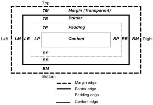
Figure : CSS2 box model
Each node generates 0..n such boxes.
All elements have a "display" property that determines the type of box that will be generated. Examples:
block: generates a block box.
inline: generates one or more inline boxes.
none: no box is generated.
The default is inline but the browser style sheet may set other defaults. For example: the default display for the "div" element is block.
You can find a default style sheet example here: www.w3.org/TR/CSS2/sample.html
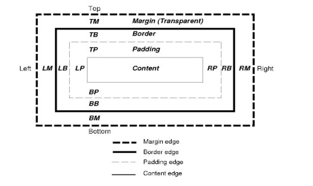
위 모델이 CSS의 박스 모델입니다.
CSS 박스 모델은 문서 트리의 요소를 위해 생성되고
시각적 서식 모델에 따라 배치된 사각형 박스를 말합니다.
각 박스는 컨텐츠 영역과 패딩, 테두리, 마진 영역을 갖습니다.
각 노드는 이런 박스를 n개 생성합니다.
모든 요소는 만들어지는 박스의 타입을 결정하는 "display" 속성을 갖습니다.
이 속성의 유형은 다음과 같습니다.
- block : 블록 박스를 만든다.
- inline : 하나 혹은 그 이상의 inline 박스를 만든다.
- none : 박스를 만들지 않는다.
기본값은 inline이지만 브라우저의 스타일 시트는 다른 기본 값을 가질 수 있습니다.
예를 들어, div 요소의 기본 display 값은 block입니다.
Positioning scheme(포지셔닝 방식)
전문
There are three schemes:
- Normal: the object is positioned according to its place in the document. This means its place in the render tree is like its place in the DOM tree and laid out according to its box type and dimensions
- Float: the object is first laid out like normal flow, then moved as far left or right as possible
- Absolute: the object is put in the render tree in a different place than in the DOM tree
The positioning scheme is set by the "position" property and the "float" attribute.
- static and relative cause a normal flow
- absolute and fixed cause absolute positioning
In static positioning no position is defined and the default positioning is used. In the other schemes, the author specifies the position: top, bottom, left, right.
The way the box is laid out is determined by:
- Box type
- Box dimensions
- Positioning scheme
- External information such as image size and the size of the screen
위치를 결정하는 방식은 세 가지입니다.
- Normal : 객체는 문서 안의 자리에 따라 위치된다. 이는 렌더 트리에서의 자리가 DOM 트리의 자리와 같고
박스의 유형과 면적에 따라 배치되는 것을 말한다. - Float : 객체는 처음에는 normal flow에 따라 배치되었다가 가능한 왼쪽이나 오른쪽으로 이동한다.
- Absolute : 객체가 DOM 트리의 자리와 다른 렌더 트리의 자리에 놓인다.
위치를 결정하는 방식은 "position" 속성과 "float" 속성에 의해 결정됩니다.
- static과 relative : normal
- absolute와 fixed : absolute
position 속성을 정의하지 않을 경우 static이 기본 값으로 사용됩니다.
static이 아닌 다른 속성 값을 사용하면 top, bottom, left, right의 속성을 사용할 수 있습니다.
박스에 배치는 다음에 의해 결정됩니다.
- 박스 유형
- 박스 크기
- 위치 결정 방법
- 추가 정보 - 이미지 크기나 화면 크기 등등
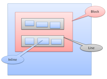
Box types(박스 유형)
전문
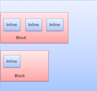
Block box: forms a block–has its own rectangle in the browser window.
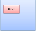
Figure : Block box
Inline box: does not have its own block, but is inside a containing block.
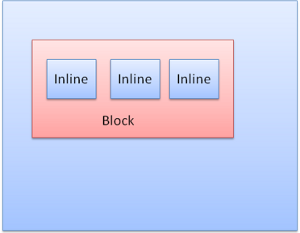
Figure : Inline boxes
Blocks are formatted vertically one after the other. Inlines are formatted horizontally.
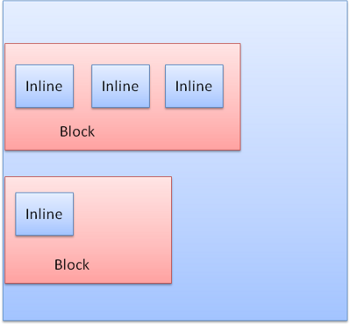
Figure : Block and Inline formatting
Inline boxes are put inside lines or "line boxes". The lines are at least as tall as the tallest box but can be taller, when the boxes are aligned "baseline"–meaning the bottom part of an element is aligned at a point of another box other then the bottom. If the container width is not enough, the inlines will be put on several lines. This is usually what happens in a paragraph.
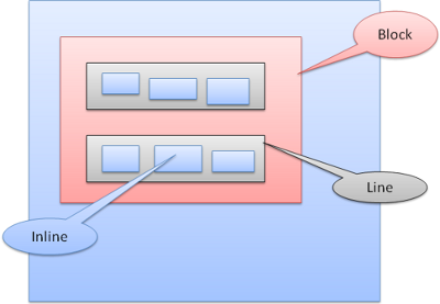
Figure: Lines
박스 유형
- 블록 박스 : 브라우저에서 사각형 블록을 형성
- 인라인 박스 : 블록이 되지 않고 블록 내부에 형성
블록 박스는 다른 블록 박스 아래 수직으로 배치되고
인라인은 수평으로 배치됩니다.
다음 이미지를 통해 블록 박스와 인라인 박스의 형식과
배치가 어떤 방식으로 되는지 확인할 수 있습니다.
인라인 박스는 라인이나 라인 박스 안에 놓입니다.
라인은 가장 큰 박스만큼 크지만 박스가 "baseline"으로 정렬될 때 더 커질 수 있습니다.
이는 요소의 하단이 다른 박스의 하단이 아닌 곳에 배치되는 경우를 말합니다.
박스를 포함하는 너비가 충분하지 않으면 인라인은 여러 줄에 배치됩니다.
다음 그림을 통해 이해할 수 있습니다.
Positioning(위치)
Relative(상대적)
전문
Relative positioning–positioned like usual and then moved by the required delta.
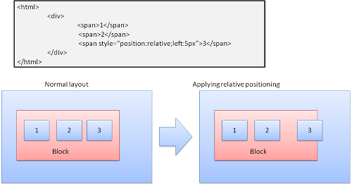
Figure: Relative positioning
Relative 포지셔닝은 일반적으로 위치가 결정된 다음 필요한 만큼 이동하게 됩니다.

Floats(플로트)
전문
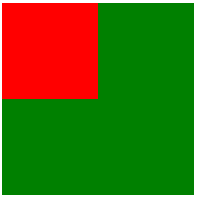
A float box is shifted to the left or right of a line. The interesting feature is that the other boxes flow around it. The HTML:
<p>
  <img style="float: right" src="images/image.gif" width="100" height="100">
  Lorem ipsum dolor sit amet, consectetuer...
</p>
Will look like:
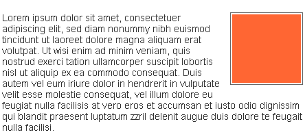
Figure : Float
float 박스는 라인의 왼쪽이나 오른쪽으로 이동합니다.
흥미로운 점은 다른 박스가 이 주변을 흐른다는 것입니다.
예를 보겠습니다.
HTML 코드입니다.


아래 실행 결과 이미지처럼 float 되어 있는 이미지 박스에
<p> 태그로 묶인 더미 텍스트가 주위를 흐르고 있는 것을 볼 수 있습니다.
Absolute and fixed(절대 위치와 고정 위치)
전문
The layout is defined exactly regardless of the normal flow. The element does not participate in the normal flow. The dimensions are relative to the container. In fixed, the container is the viewport.
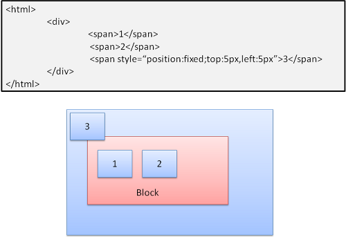
Figure : Fixed positioning
Note: the fixed box will not move even when the document is scrolled!
absolute와 fixed의 배치는 normal 흐름과 무관하게 결정됩니다.
absolute와 fixed로 배치된 요소는 normal 흐름에 참여하지 않습니다.
absolute와 fixed로 배치된 요소의 치수는 컨테이너의 크기와 연관되어 있습니다.
fixed 배치된 요소는 컨텐이너의 viewport로부터 위치를 결정합니다.
고정된 요소는 문서가 스크롤되어도 움직이지 않습니다.

Layered representation(층 표시)
전문
This is specified by the z-index CSS property. It represents the third dimension of the box: its position along the "z axis".
The boxes are divided into stacks (called stacking contexts). In each stack the back elements will be painted first and the forward elements on top, closer to the user. In case of overlap the foremost element will hide the former element.
The stacks are ordered according to the z-index property. Boxes with "z-index" property form a local stack. The viewport has the outer stack.
Example:
<style type="text/css">
      div {
        position: absolute;
        left: 2in;
        top: 2in;
      }
</style>

<p>
    <div
         style="z-index: 3;background-color:red; width: 1in; height: 1in; ">
    </div>
    <div
         style="z-index: 1;background-color:green;width: 2in; height: 2in;">
    </div>
 </p>
The result will be this:

Figure : Fixed positioning
Although the red div precedes the green one in the markup, and would have been painted before in the regular flow, the z-index property is higher, so it is more forward in the stack held by the root box.
층은 CSS의 z-index 속성에 의해 명시됩니다.
층은 박스의 3차원 표현으로, 쉽게 말해 박스의 z 축을 의미합니다.
박스는 stacking context로 불리는 스택으로 나뉩니다.
각 스택에서 뒤쪽 요소가 먼저 그려지고,
앞쪽 요소는 사용자에게 가까운 쪽으로 나중에 그려집니다.
때문에 가장 앞쪽에 위치하는 요소는 겹치는 뒤에 요소를 가리게 됩니다.
스택은 z-index의 속성에 따라 순서를 결정합니다.
z-index 속성이 있는 박스는 local stack을 형성합니다.
viewport는 outer stack입니다.
예제를 통해 이해해보겠습니다.

이 HTML 코드는 다음과 같이 보이게 됩니다.
배경색이 빨간색으로 지정된 div 태그가 초록 색으로 지정된 div 태그보다 앞서 등장하기 때문에
일반적으로는 빨간 색으로 지정된 div 태그가 먼저 그려지지만,
빨간 색으로 지정된 div 태그가 z-index 속성으로 더 큰 값을 가지고 있기 때문에
더 앞쪽에 그려지게 됩니다.
이번 글을 끝으로 브라우저는 어떻게 동작하는가에 대한 정리가 모두 끝났습니다.
😭😭😭😭😭😭👏👏👏👏👏👏👏
첫 번째 글이 2021년 9월 25일에 작성되었으니
거의 3달 만에 마지막 글을 작성하게 됐네요
중간중간 다른 걸 병행하다 보니
처음에 예상했던 것보다 더 기간이 오래 걸린 것 같습니다.
처음에 목차 부분에서도 언급했다시피
이 글을 시리즈로 작성하게 된 것은
브라우저가 어떻게 동작하는지 초보자의 입장에서 하나하나 알아보고,
혹여나 저 같은 초보자가 브라우저가 어떻게 동작하는지 알고 싶을 때
이해하기 쉽게 정리를 하기 위함이었습니다.
하지만 글을 정리하다 보니
초보자에 입장에선 아예 이해가 안 가서
하나의 개념을 이해하기 위해
다른 몇 개의 개념을 공부해야 하는 상황들이 생겼습니다.
그러다 보니 글 전반에 걸쳐
제가 이해하지 못한 부분은 내용 정리에서 끝난 경우가 많은 것 같습니다.
제가 쓴 8개의 글을 다시 읽어보면서
'초보자가 과연 이 글을 읽고 이해할 수 있을까..?
정리한 나도 이해가 잘 안 가는데?'라는 생각이 들어
무척 부끄러워졌습니다. ㅜㅜㅜㅜ
때문에 정리 글은 이번 시리즈를 끝으로 마무리하지만
다음에 별도의 글로
8개의 시리즈를 총정리하는
'브라우저는 어떻게 동작하는가 (총정리)'를 작성할 예정입니다.
부디 총정리 글에서는 초보자가 이해하는데 도움이 되는
글을 작성할 수 있었으면 좋겠습니다.
아 그리고 이건 여담인데
저는 HTML이나 CSS, JS를 모르는 상태에서
브라우저 동작 원리를 정리했었습니다.
그리고 글을 작성하던 중간인
11월쯤에 HTML/CSS/JS 공부를 시작했고요
이 얘기를 하는 이유는
HTML/CSS/JS에 대한 배경지식이 있고 없고 가
본 글을 이해하는데 큰 차이를 만든다고 느꼈기 때문입니다.
후반에 배치라던지 페인트 등의 내용들은
이미 HTML/CSS/JS 실습을 통해 개념을 알고 있다면 이해가 쉽고
개념을 모른다면 이해가 어렵습니다.
실제로 글을 정리하면서 '이게 대체 뭔 말이야?' 했던 게
HTML/CSS/JS 실습 이후에는 쉽게 이해되더라고요ㅜㅜ
그래서 만약 생초보자라면
브라우저 동작 원리는 지극히 개념적인 내용이기 때문에
HTML/CSS/JS로 페이지를 만드는 실습을 우선적으로 해보시고
글을 읽어보시는 걸 추천드리고 싶습니다!!
'내가 공부하려고 올리는 > web' 카테고리의 다른 글
| HTTP 총정리 (0) | 2022.02.13 |
|---|---|
| HTML/CSS/JavaScript를 사용해 개인 포트폴리오 사이트 만들기(2) (0) | 2021.12.11 |
| HTML/CSS/JavaScript를 사용해 개인 포트폴리오 사이트 만들기(1) (2) | 2021.12.11 |
| Web - REST API (0) | 2021.11.22 |
| Web - 동기 vs 비동기 프로그래밍(자바스크립트) (0) | 2021.11.22 |


댓글